

Built for everything institutional branding couldn’t be.
about
I developed Brutus as a parallel visual language to give student life, athletics-adjacent programs, and extracurricular culture a distinct voice within the GBC brand ecosystem.
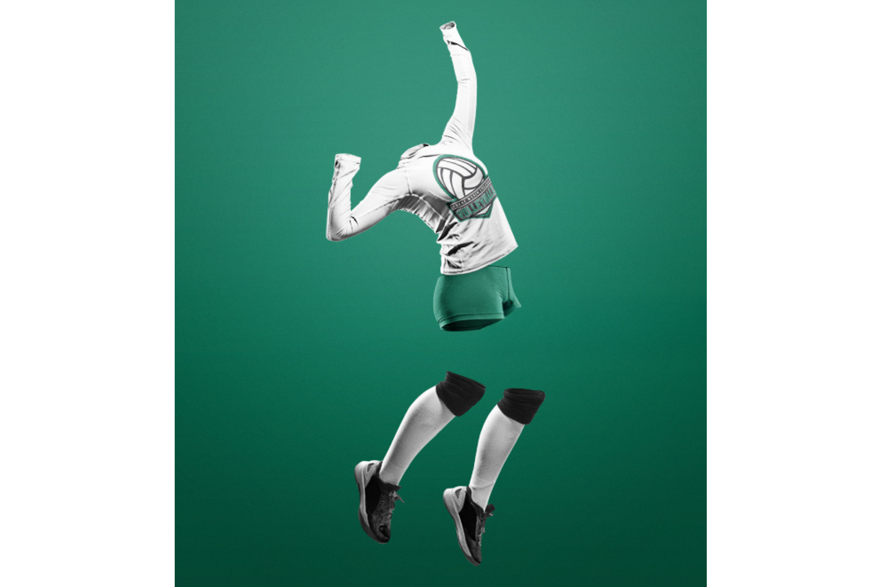
It began with the Choose GBC wordmark and evolved through esports, volleyball, and club identities, eventually coalescing into a cohesive mascot-led system. Brutus was designed to be bold, flexible, and expressive, able to live on apparel, signage, digital, and event materials without competing with GBC’s institutional brand.
What began as a single mark has grown into a system adopted campus-wide, shaping how student life presents itself and how students choose to participate in it.
role
Creative Direction, Art Direction, Visual Design, Copywriting, Photography, Campaign Leadership
Legacy Iconography evolution
-
GBC had a strong institutional brand that was recently refreshed and well-defined, but it wasn’t built to connect with student life.
The academic identity worked in formal contexts, but it lacked a visual language for clubs, athletics-adjacent programs, and extracurricular culture. Without a system designed for energy, identity, or pride, student-facing initiatives relied on inconsistent visuals and one-off solutions that diluted the overall brand.
The challenge was to create a complementary visual language that could live alongside the academic brand. My goal was to create something that was modern, flexible, and recognizable, while giving students something they could actually see themselves in.
-
Initial work on Choose GBC surfaced a broader need for a student-facing visual language that could extend beyond enrollment messaging into culture, competition, and identity.
Researched how peer institutions, including UNR, UNLV, and smaller regional colleges, used mascot-driven iconography and athletics-adjacent branding to build pride and engagement outside formal academic contexts.
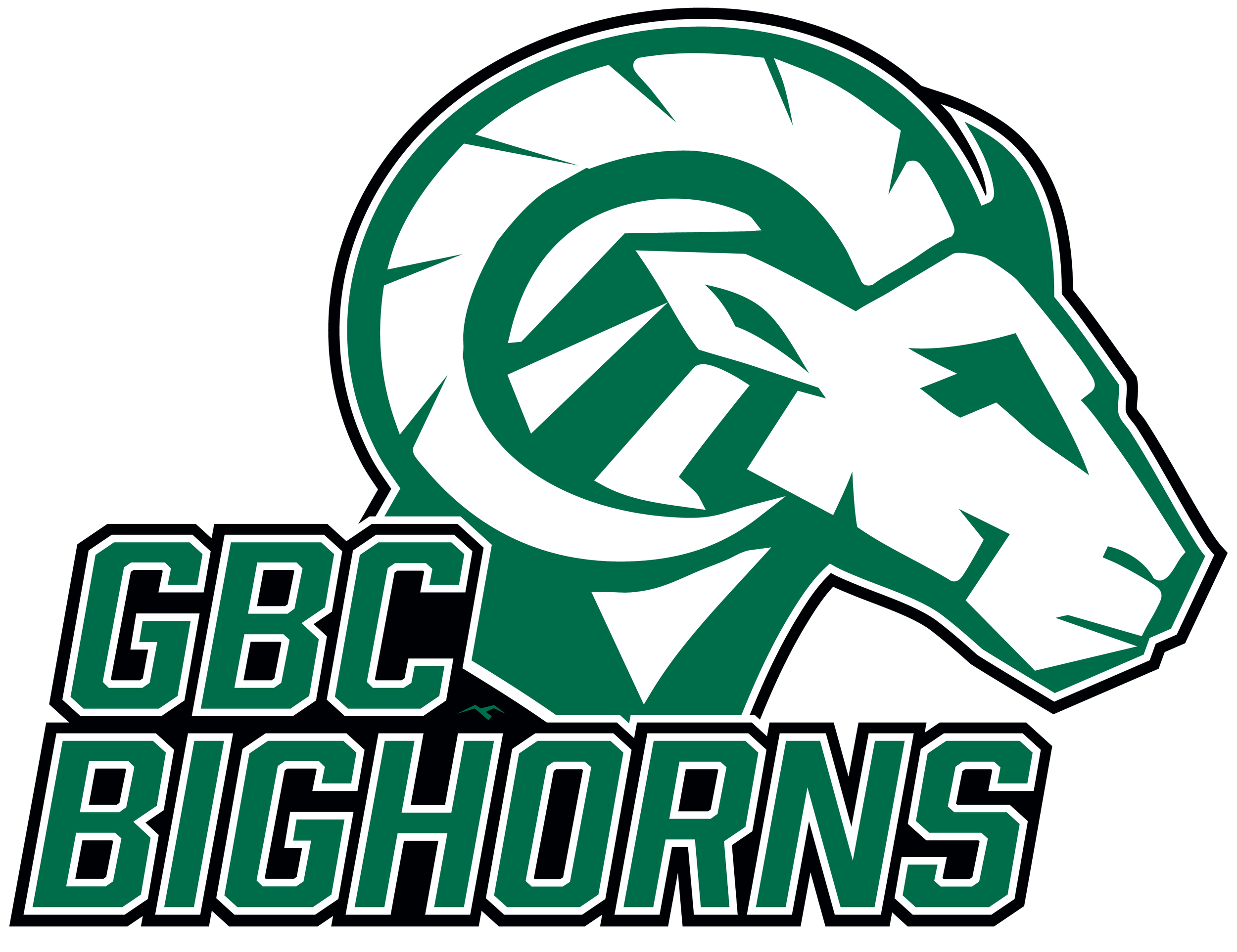
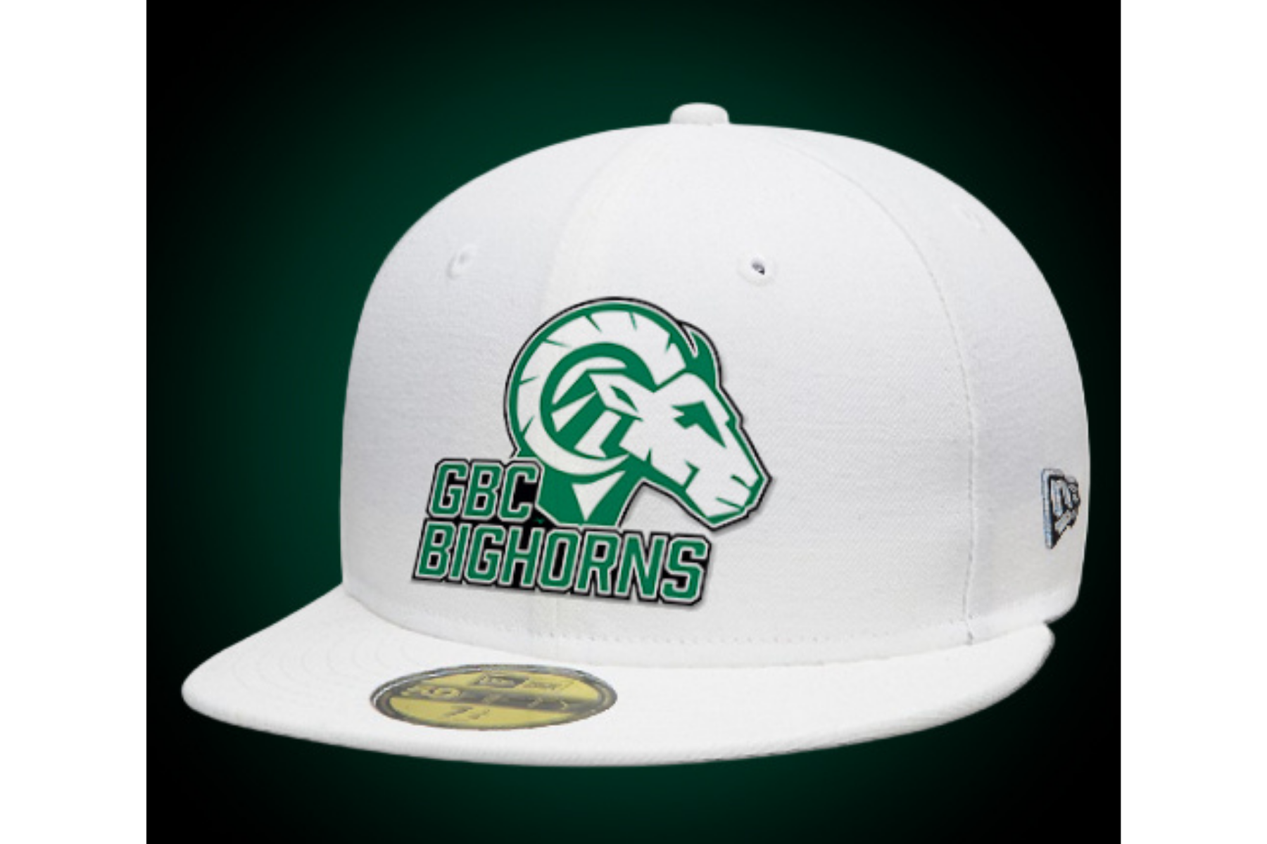
Audited GBC’s existing and historic bighorn sheep iconography and identified opportunities to evolve it into something more expressive and flexible. This exploration led to the development of Brutus, a modernized mascot-led system designed to represent student life without competing with the institutional brand.
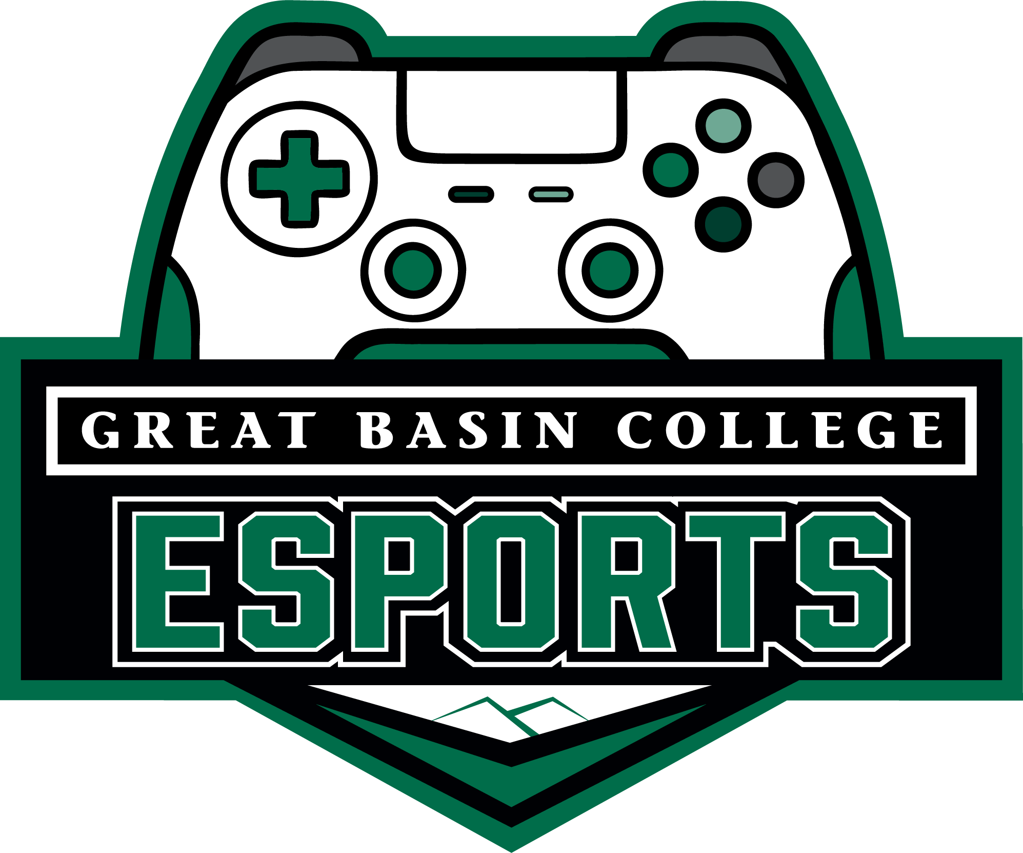
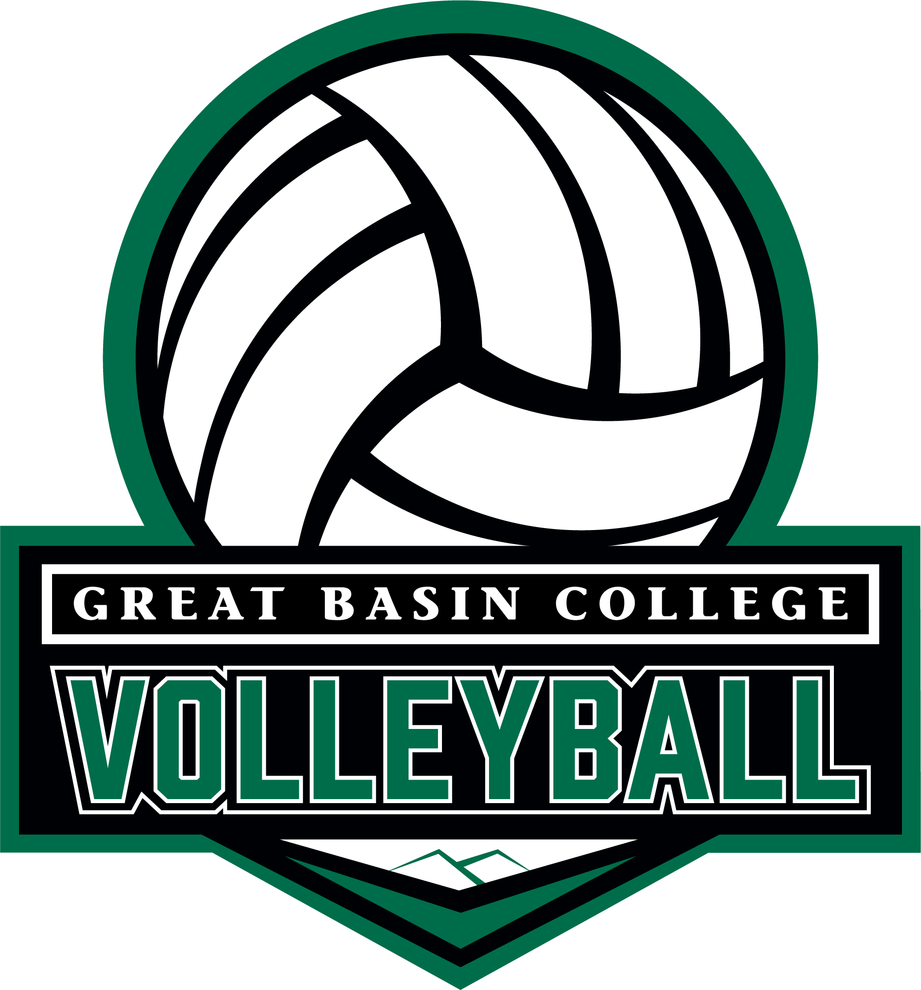
Expanded the language through esports, volleyball, and club identities, refining form, contrast, and attitude until it resolved into a cohesive system capable of scaling across apparel, events, digital, and environmental applications.
Ran iterative creative sprints using early performance data to refine creative direction
-
Brutus was adopted across student life, clubs, and athletics-adjacent programs as a shared identity system. It appeared consistently across events, organizations, digital platforms, and physical applications, providing a cohesive visual presence for extracurricular culture.
The system’s flexibility allowed programs to apply it without heavy oversight, maintaining recognition while supporting a wide range of use cases.
-
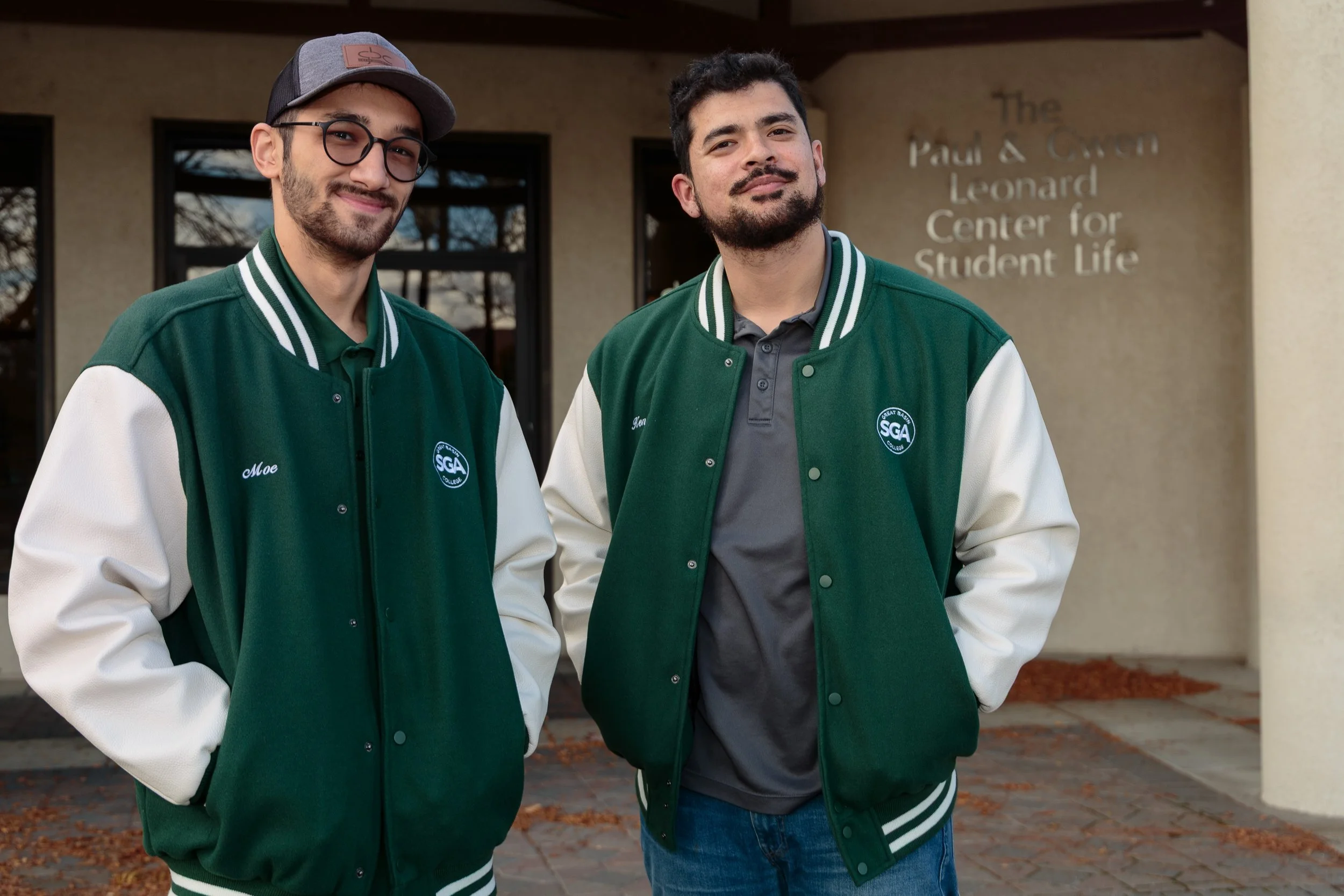
Brutus shifted from a designed system to a student-owned one.
The visual language was embraced organically, with student-led groups adopting it for merchandise, events, and apparel, including thematically aligned varsity jackets and club branding.
The system gained traction through relevance and resonance.
Brutus now functions as a living extension of the GBC brand, shaped by real participation, not just marketing intent.